


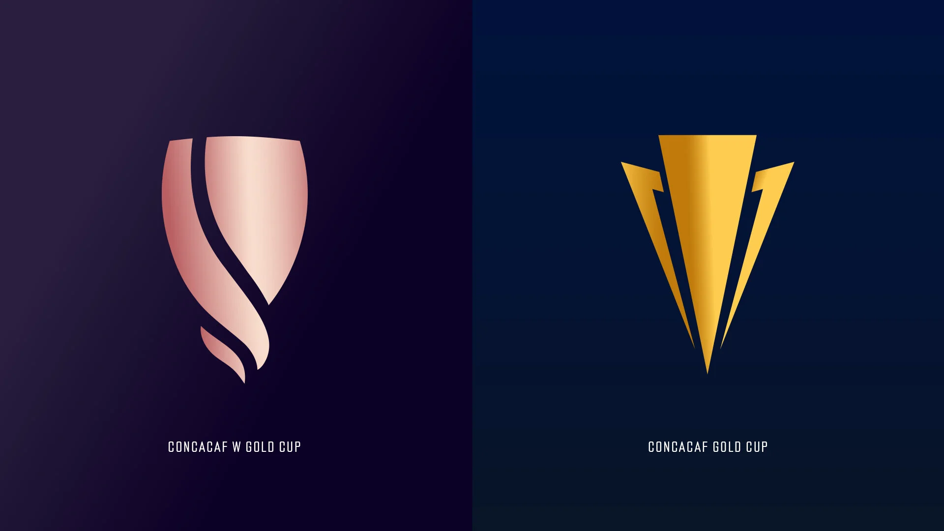


Evoking a graceful and powerful movement, this brand weaves together an elegant icon with a bold, established wordmark. The request from Concacaf was to create a brand that could live alongside the men’s competition, but also set itself apart by creating a unique space within not only women’s soccer, but the entire soccer world. My task: establish the Concacaf W Gold Cup as unapologetic, unmatched, undeniable.
Subtle curves are cut into the wordmark, creating a distinct connection between the lockup. It was imperative that the icon and wordmark work as well separately they do together.
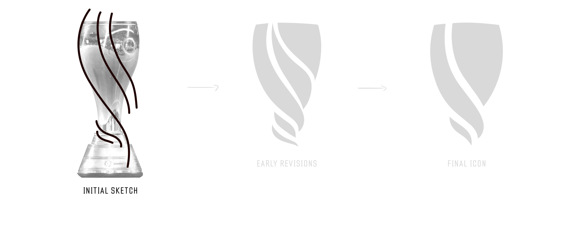
I addressed the client’s request to build off of the existing trophy’s shape by taking an abstract approach to capturing its timeless features. The final icon is inspired by the strong lines of the active human form and the resilience of fibers woven together as one, the icon stands as a unmistakeable pillar of this brand.
With a show-stopping rose gold trophy, the essence of the logo needed to match. Tinkering with color combinations that illicits luxury and realism, I settled on a more dramatic contrast of rose tones to mimic light shining off the trophy’s metal surface.
After solidifying both type and color palette, I developed examples of how the brand should be executed for print, OOH, and digital applications. Combination of logo, type and color would be woven together to create an impactful, multi-tiered campaign that focused on the emotion behind our central message: OUR LEGACY. OUR CUP.
The approach the team proposed and developed was two-pronged: a darker, more subdued color palette that used the icon and imagery as textures & an energetic, typography driven campaign that highlighted the secondary color palette and paired it with monotone imagery.
END RESULT: Concacaf released the brand and the timeline for the tournament on August 19, 2021. The sports world was abuzz about the Concacaf W Gold Cup with coverage spanning sports channels and traditional news outlets alike. Conversations spanned ESPN, Fox Sports, Sports Illustrated and more as the brand made its way to audiences around the world. The plan until the debut in 2024 is to establish a grassroots brand presence while spreading brand awareness through activations and fan interaction on social media.